A few months have passed since the Worlds 2020 finals, in which we saw DAMWON Gaming be crowned world champions by lifting the Summoner’s Cup in the city of Shanghai, China, managing to bring back the international competitive crown to the LCK.
All this happened in view of the change in format that the Korean league will have for the 2021 season, in which the franchise system will finally be implemented, something that is already applied in leagues such as the LCS and the LEC, and in which the ten teams that will participate for regional glory have been announced.
That is why today, the LCK announced through its social networks a rebranding for next season, showing more innovative and dynamic designs, while being minimalist and bright.
Marking what will be a new era for the league, the new look of the LCK boasts contemporary and sophisticated designs, with a lot of synchronization and precision, much like the LEC style.
With visual elements that stand out through bright backgrounds and that will play with gravitational movements and different elements of contrast, the rebranding is distinguished by creating a unique atmosphere, something that viewers will be able to enjoy a lot through live broadcasts.
All this will allow the LCK to create shocking content, which will captivate the players who follow the competition, either in person or through streaming, further fueling the impact of the digital experience they can provide to the international public.
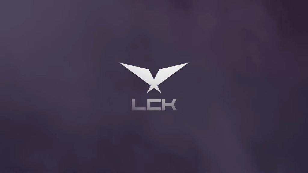
A new logo inspired by the past and the future
However, what stands out the most among all these elements is the presentation of the new logo that will represent the LCK in the competitive scene, which has a simple design, but with a meaning that pays homage to the already famous previous logo.
Retaining part of the shape of the LCK star, it’s composed of two superimposed shapes that resemble a phoenix with its wings open in mid-flight, making this a simplistic and geometric logo, but with great airs to the past and the future of the Korean league.
This way, one of the most powerful leagues in the League of Legends competitive has shown its new face, a few weeks before the 2021 season officially begins and with great expectations from the teams that are part of it.